Fortis Healthcare Solutions is a newly formed national entity uniting several trusted brands within the healthcare staffing arena, including AB Staffing Solutions, Adaptive Workforce Solutions, Prime Time Healthcare and Prime Workforce Solutions.
In advance of its launch, company executives wanted to ensure consistency in messaging, visual representation and customer experiences across all touchpoints, while still allowing the sub-brands to retain their unique identities. Building upon a brand strategy developed by a fractional CMO, we created a comprehensive visual identity system to communicate Fortis’s values and aspirations in a versatile, creative and authentic way.
Logo
The word fortis comes from Latin, meaning “strong,” “brave” or “courageous.” We designed the logo to represent strong partnerships among the parent company’s brands, while also referencing the healthcare industry. The logo type is Montserrat, a modern geometric sans serif font with rounded corners and slightly condensed proportions. The logo symbol is built from the medical “plus” sign. The blue is derived from “H” hospital signs. All the colors were taken from the Fortis family of brands and adapted into jewel tones.
Color palette
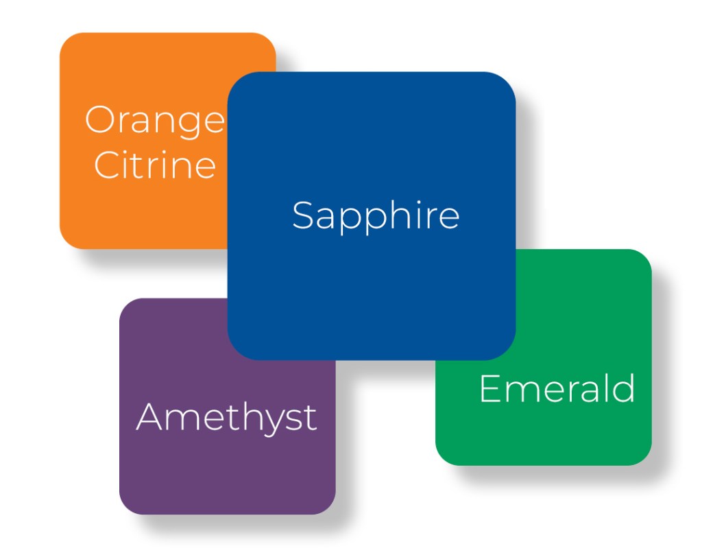
Sapphire, a deep, rich blue that dominates the Fortis logo, symbolizes trust, intelligence and stability. It conveys a sense of security and expertise, essential qualities in healthcare. The other primary colors are:
- Orange Citrine: A bright color that symbolizes optimism, energy, healing and positivity
- Emerald: A rich green that represents growth, harmony and a sense of wellness and balance
- Amethyst: A deep purple associated with wisdom, creativity, innovation and forward-thinking
Print and digital designs
We built the company’s templates upon two creative themes. Cubes are derived from the logo and represent the synergy of the Fortis family of brands, in which the whole is greater than the sum of the individual parts. From a design standpoint, cubes create a sense of energy and movement, drawing in the audience. Frames and brackets represent the coming together of different companies under the Fortis brand. They also create a sense of focus and clarity, inviting the audience to explore and discover.

Strategic co-branding integration

A critical aspect of the project was the successful integration of Fortis’s sub-brands. We designed a set of co-branded logos to represent the relationship between Fortis and AB Staffing Solutions, Adaptive Workforce Solutions, Prime Time Healthcare and Prime Workforce Solutions.
Collaborating closely with marketing leadership for each of the Fortis sub-brands, we also designed print and digital templates to ensure a professional and unified appearance across all their communications.
Launch materials
To prepare the company for launch, we created a 54-page brand book with guidelines for implementing the new brand identity system, including logo usage, color application, design samples, typography and photography.
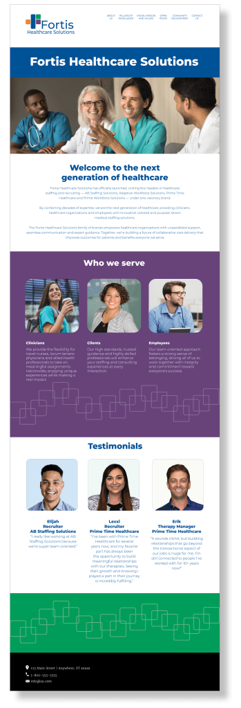
We also designed a website and wrote the copy, handing off the elements to a contract web developer. The website introduces Fortis Healthcare Solutions and its family of brands, and also includes its target audiences (clinicians, clients and employees), the company’s mission and vision, and testimonials from constituents.
We also wrote a news release and LinkedIn post announcing the new company and its family of brands. These foundational assets ensured a consistent and impactful debut across all communication channels, setting the stage for a successful market entry.
Results and impact

Through these comprehensive branding efforts, Fortis Healthcare Solutions is now empowered with:
- Unified brand identity: A consistent and cohesive image across all internal and external communications, effectively uniting its diverse portfolio of sub-brands
- Visual appeal: A modern, inviting and professional visual identity that attracts attention and encourages engagement
- Operational consistency: Practical guidelines for brand implementation, ensuring visual integrity across all materials
